SOFTWARE and USER INTERFACE
 MAIN SCREEN
There are many aspects to this screen which appear to have been haphazardly-placed. The indication that you are “online” looks like it was placed as an afterthought, as does the question mark in the upper-left corner. (That button gives an overlay of the entire screen, showing you what each part of the interface does.)
My largest concern for this screen is that most buttons do not respond like buttons normally do on iOS – with a “touched” state and some visual cue to show that I’ve touched it. This is particularly noticible when the app first begins, seemingly with some race condition between me wanting to start a game and the server sending existing data to the client.
Notably missing is any way for SBE to communicate to its users. There isn’t even a list of articles on the website, nevermind a real, curated “front page” main menu. There are many interesting articles and discussions, tournaments, and sales that happen that are easily missed unless one already knows where to look.
PLAY
By default, the Main Menu starts in the Play menu. Options that appear to the right show the games you are playing and it contains an option to start a game. The flow of actually starting a game involves several steps that aren’t intuitive; the header at the top becomes a “start button” even though it doesn’t look like any other button in the app.
Step 1: 
Step 2: 
Step 3: 
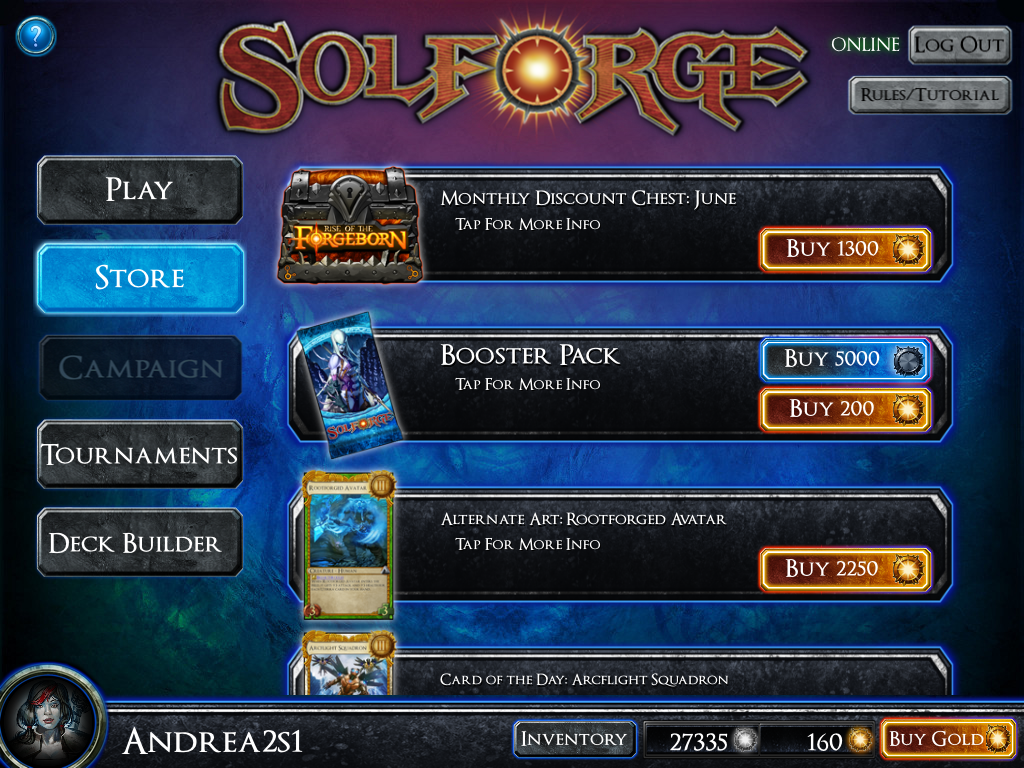 STORE
STORE
The Store also takes place in the Main Menu and not in its own separate page. While this makes checking today’s deals pretty quick, it does mean that the store needs to only take the same amount of space as the Play menu does. I believe this is a major mistake for several reasons: mainly, it makes the store look like an unsorted mess.
The store has several things to purchase — packs, chests, decks, event tickets, alternate art cards, playmats — but they are presented in one seemingly-unsorted list. As an example, the default booster pack appears near the top, while the Forgeborn boosters appear much later, after several unrelated options. Even if the Store wasn’t its own screen, it would still make sense to have the various items appear in a sorted fashion, ideally with quickly-accessible shortcuts for each option.
INVENTORY
Inventory is related to the Store. It contains a list of everything you’ve purchased and have unlocked for your account that you haven’t used up. (Your “deck slots” and “skins” last forever, while your boosters are obviously there waiting to be opened and turned into cards.) Not much to do here; it does its job well.
 TOURNAMENTS
The tournaments screen is outstanding. It shows the events you have entered and can enter, their prizes and costs, and your current standings in each in one simple intuitive interface. (Details about the Tournaments are found in the Organized Play article, coming soon.)
 BUY GOLD
Gold is the main currency for purchases. The prices for gold are identical across platforms, and the bonuses are also identical. Unlike the Store, which appears very disorganized, the Buy Gold popup appears hand-crafted and gets it all right. It shows the amount of gold you are getting, the bonuses you get for higher purchases (including a percentage bonus too — a smart addition). It makes the biggest button the most-expensive purchase, and highlights it with a “Best Value!” bit of text added in. What happens when you click or tap depends on the platform – on iOS you get the standard In-App Purchases popup, on Windows you are taken to the Steam Store.
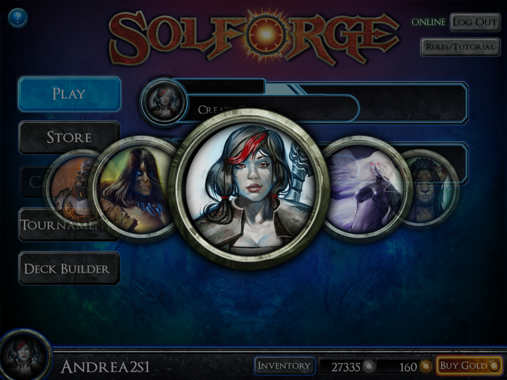 USER ICON
Tapping the user icon in the lower-left corner brings up an overlay of several icons to choose from. However, unlike many other similar popups, this one neither has an “X” to close it nor can you close it by tapping away from the icons. You must always choose an icon to dismiss this overlay, and that is counter-intuitive.
Also, scrolling between icons on iOS is counter-intuitive: swiping to the left or right will scroll the list exactly one icon, regardless as to how far you scroll with your finger. It treats this list as if they were pages in a book to be flipped through, but the visual metaphor does not indicate that sort of user action at all.
 TUTORIAL
The bottom part of the screen is similar to the how-to-play section of the SolForge website. The “Play Tutorial” button on the top of the screen isn’t obvious that it is a button, in my opinion. Tapping or clicking it will take you into the game with a popup-driven tutorial game. My complaint about the size of the popups apply here. They are all too small and use too-small of a font.
 DECK BUILDER
The deck builder interface is critical to get correct, and it is the most-difficult. SolForge does a decent job overcoming the iPad’s limitations, but does so at the expense of having a very cramped interface. The interface seems overly tied to the Magic Online model of deckbuilding. The current UI conceit for complex menus is to hide them in a side menu under a “hamburger” icon, and I can imagine a major improvement from moving the menu to the side.
The interface for the PC version has even fewer options than the iPad version, which is something of a shock. I can’t toggle the card levels, which makes deck building with cards I don’t have memorized a bit more difficult.
 FORGING
The forging system is accessed through the deck builder, which only makes sense if you have played Heartstone. There is no way to “find” forging in the app at all, other than double-tapping on a card. On a PC, you single-click instead. These differences don’t make any sense to me – if you are going to have a different input sequence for the PC, why not use the right-click?
There should be main-menu access to a feature to quickly forge and construct cards. The feature, as it is currently implemented, is barely functional.
 GAMEPLAY SCREEN
The gameplay screen is very economical in its layout, giving high priority to the cards and the battlefield, but this comes at the expense of hiding key features.
This screenshot shows an advanced game state. I have five creatures in play, each with their own effects. Armor looks like a shield, regeneration is the green circled-triangle, the red exclamation point indicates a special ability. The large SolForge symbol on the two creatures on the right side of the screen indicates that those creatures are on the Defensive, and won’t fight this turn. On the bottom of the screen is my hand of cards. On the right is my hit points (39, which means I am in trouble but winning anyways) and my player level (4, which means I can play cards of level 4 or below).
The question mark brings up an overlay describing what things do on the screen. I don’t see this as a useful feature beyond its first or second use; I’d rather a dedicated “game log” button was there instead. The “gear” button in the lower-left of the screen brings up a settings menu and a link to the game log. The gear is flavorful but it barely looks like a button to click or tap.
 DRAFTING
Draft tournaments are a great test of skill with an emphasis on someone’s ability to assemble a great deck through strategic choices, rather than through acquiring the cards for a deck from the store. Players select one of the cards from the right and drag it or double-click it to add it to their draft deck. Those six cards disappear and are replaced with five new ones. Repeat until you have drafted five cards, then a new collection of six cards to pick appear. Repeat until you have a deck of 30 cards, then you go into tournament games. The interface for drafting is a bit plain but it gets the job done.
SWOT ANALYSIS FOR THE USER INTERFACE
STRENGTHS
The gameplay interface is outstanding for new users.
If there is a card you can play, it is highlighted. When you click or tap it, the valid targets become highlighted instead. Multi-target spells work intuitively. Everything is explained using only a few words. And when you might possibly make a mistake (such as, destroying your own creature with a spell) the game asks if you are “absolutely sure you want to hit your own creature with a negative effect?” For the new-user experience, the gameplay interface is the very best in the industry right now.
The top level of the menu structure is clean and obvious.
There are several options from the main menu, with large buttons that are easy to find and click or tap.
The user interface has a consistent, unique, approachable style.
Most of the buttons have a “SolForge” feel to them. The few exceptions really stick out, however. Overall the interface feels consistent… as if you were using some software from within that world, while still able to find what you want in this one.
WEAKNESSES
There is no “News” screen.
The lack of communication between the players and SBE from within the app is a critical mistake, one that can easily get fixed in an upcoming version. There is a lot of time and money being spent on content and promotions that are certainly being missed by many players because of this missing feature.
The game-start process sticks out as a sloppy design.
Creating a game involves clicking several things in several positions on the screen, with no flow from one button to the next. In addition, many labels look like buttons, and many buttons are improperly aligned. This problem isn’t likely to cost SBE too many customers or too much money, but it is possibly hurting them in the conversion of trial users into dedicated users. (Once you are a dedicated user, this problem is probably ignorable.)
Many advanced aspects of the gameplay interface are buried.
Of particular note is the Log feature. It is sometimes critically important to know which cards have been played while you were away or in another match. To find this, you need to click a gear in the lower-left corner of the screen, then click the Log button, then scroll down to the last turn, then after you are done you need to exit the log, then exit the settings screen. Too many taps or click to do a simple thing.
The deck builder interface is very cluttered.
Hearthstone does a remarkable job maximizing available screen space. While I wouldn’t advocate copying its deck building screen, there are important lessons to take from it. Namely – if a card is in a deck, it is assumed the player knows what the card is (and therefore that can take less space on the screen).
OPPORTUNITIES
n/a
THREATS
SolForge is no longer the only iPad-focused digital TCG. Hearthstone has shipped with a great launch, and others are on the way. What was “good enough” last year will seem tired next year (look at Magic Online and compare it to almost any digital TCG for PC since its release)…
QUESTIONS TO ASK:
Heat map tracking of player taps and clicks can be implemented to determine which aspects of the interfaces are used the least and the most. The results should guide future development.
INTERFACE SCORE: B- (windows), C+ (ipad)
The Windows version gets a slight bump for interface buttons that are more responsive to clicks than the iPad version is to touches, especially in the main menu.